Thursday, June 26, 2008

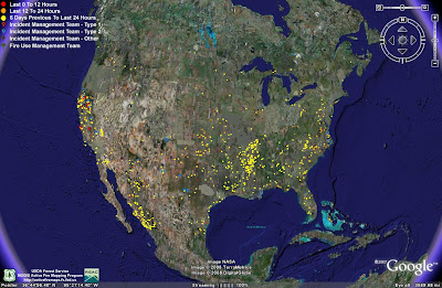
MODIS remote Sensing view in Google Earth


This is a picture of MODIS fire detection. All of the dots represent fires that have been detected i nthe past 7 days. They are categorized by the time they occured. as you can see, there are bad fires in California right now.

Wednesday, June 11, 2008

Lorenz Curve


This represents a Lorenz Curve. It shows the hoursehold income of people living in Maldives in 97/98 and 2002/2003.

Parallel Coordinate Graph


This is a parallel cooridinate graph of baseball statistics. It shows statistics from many different players. The top of the graph is the lead for that particular statistic.

http://www.matthewtavares.com/baseball_report/graph_allteams.bmp

DLG

http://edc.usgs.gov/images/dlg.gif
This is a DLG showing hydrography and transportation layers. The blue lines are the hydrography layer and the orange lines are roads.

Triangular Plot

http://www.ex-parrot.com/~chris/images/20050407/triangle.png

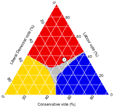
This is a triangular plot of election votes. It shows where the votes are coming from: Conservative, liberal democrat or labour.

Proportional Circle Map

http://www.statcan.ca/english/Estat/guide/census1.gif

This is a proportional circle map of Canada. It shows the population. The bigger the circle, the more population.

Hypsometric Map


This is a Hypsometric map of Tajikistan. It shows the elevation of the land with contours and shading.

PLSS Map


This is a PLSS map of Franklin County Alabama. It also shows Township and Range

Cadastral Map


http://www.sli.unimelb.edu.au/subjects/451/418/418_2001/images/lecture08_8.jpg

THis is a Cadastral map of an area in Austrailia. It helped to re-establish boundaries.