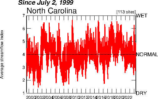
This is an index value plot of the streamflow in North Carolina. It shows whether the streamflow was above average (wet), average, or dry from 1999-2008.

 This is a Flash Density map of the United States. It shows the amount of lightning flashes per square km per year. Florida proves tobe the lightning capital of the world.
 This is a bivariate choropleth map comparing population density and population change in Russia. It seems that the higher population density had the higher population change.
 This shows the population of American Indians by location (in the thousands). The bigger the circle, the bigger the population of American Indians in that location. California seems to have the highest amount of American Indians.
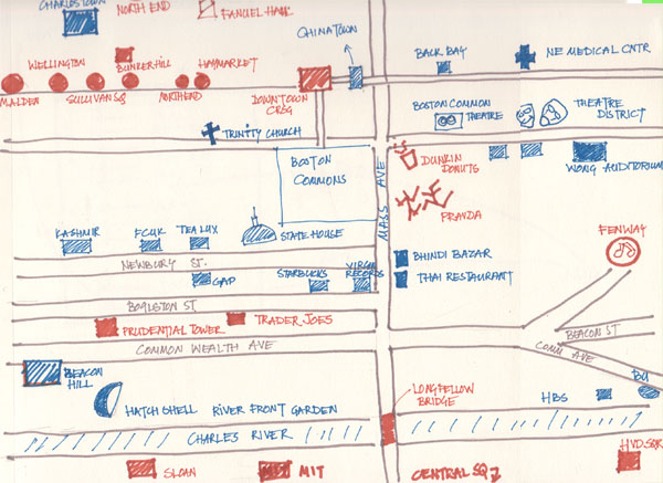 This is a mental map. It was drawn from memory, and from the creater's point of view. It could have been drawn quite differently if it were done by a different person. It is individually created by the person and from their memory/interpretation.
 This is a similarity matrix comparing different types of organisms. The red line that goes down the center suggest high similarity or exactness. The different shades of blue (and green) represent how similar the organisms are.
 This is an isopach of the Western Canada Sedimentary Basin. Ther pink dots represent wells. and the thicker parts are shaded in light (very light, and it's hard to make out) blue.
 This is a windrose of an area around the Savannah River. The wind seemed to come fro mthe northeast and the Southwest. The wind rarley ever came from the Northwest.