Sunday, May 11, 2008

Population Profile


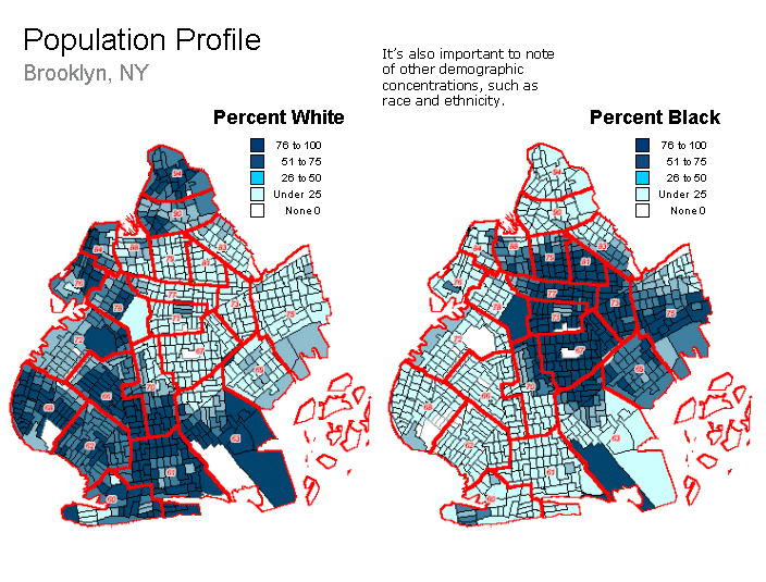
This population profile shows the population that is White vs. the population that is Black in Brookly, NY. It shows that most of the White population lives in the southwest part of Brooklyn, and most of the Black population lives in the Northeast part of Brooklyn.
http://aspe.hhs.gov/HSP/prison2home02/Cadora/slide05.gif

Scatterplot


This is a scatterplot showing the relationship between a wife's age and her husband's age. There is a very positive correlation between the two.

DOQQ


This is an example of a DOQQ. It has been digitally corrected from bad camera angles and shadows. This makes it a more accurate and clear aerial photo.

LIDAR

This is a LIDAR image of lower Manhattan. It shows the height of the builings in 3-D. You can see the height of the "rubble" from where the World Trade Centers fell. It helped with the plans of recovery.
http://www.noaanews.noaa.gov/stories/images/manhattan-lidar092701.jpg

Infrared Aerial Photo

In this infrared aerial photo, the red shades indicate vegitation (and the tone of red indicates how well it is growing); tan or green indicates dead vegetation; green, blue or white can indicate ground areas, depending on the moisture and composition of the soil.

Climograph


This is a climograph for Memphis Tenniseee comparing precipitaion and temperature throughout the year. The temperature is colder on either ends of the year, and hotter in the middle. The precipitation is the least right around when the temperature is the greatest, and the most when the temperature is the lowest.

Black and White Aerial Photo

This is a black and white aerial photo of an area in Kansas. Aerial photos are good for showing actual sizes and distances because it is an actual photo. This photo shows roads, highways, houses, water, buildings, and more.
http://freegeographytools.com/wp-content/uploads/2007/09/doq-thumb.jpg

Doppler Radar

This is a Doppler Radar picture of Hurricane Charley. Doppler radar picks up the precipitation (and may also pick up fog, smoke, etc.). The green and blue shades are the lighter precipitation. The yellow, orange and red (and sometimes purple) are where the heavier precipitation is.
http://www.weatherusa.net/blog/images/doppler-orlando-1943.gif

Cartographic Animation


This is an example of a cartographic animation. If you move your mouse over the classed or unclassed data, the data displayed in Nebraska will change to display the specific data for that disease. (Since I could not upload the interactive version, I uploaded the still version). Visit http://maps.unomaha.edu/AnimArt/ActiveLegend/JavaScript/java.html for the interactive version. :-)


Statistics Map

This is a statistic map of the change in burglaries from 2001 to 2002. It gives the number and the percentage of burglaries of each county. The counties that decreased in number seem to be a little clustered together (as with the increased in number). There is also more increased numbers of burglaries than decreased.

Cartogram

This is a cartogram of the World's economy. It shows that North America, Western Europe, Japan, and South Korea have the largest GDP. Countries that have lower GDP are represented as physically smaller on the map (proportionally).

http://maps.grida.no/library/files/world_economy_cartogram_001.jpg

Flow Map

This is a flow map of how to make a peanut butter sandwich. You start with "Get two pieces of bread", and follow the arrows and directions until it says "Eat and Enjoy". It is a step-by-step process.

Propoganda Map

This is a propoganda map made, most likely by the British, about what the Nazi Parti's goals are. It shows that the Germans plan to slowly take over.
http://strangemaps.files.wordpress.com/2006/12/10.jpg

Thematic Map

This shows the average soil depth for the Illinois River Watershed area. It shows that the soil depth is deeper in the southwest part and along major watershed areas, and shallower where there are not many major watersheds (with small exceptions).

Planimetric Map

This is a Planimetric map of Lake Geogre. It shows the relative horozontal distance of different features of a landscape. This map has all roads and most major trails, railroads, airfields and ferry lines, boundary lines, buildings, and most water features.

Star Plot

This is an example of several different star plots. They show different observations about different cars, including Price, Mileage (MPG), 1978 Repair Record (1 = Worst, 5 = Best), 1977 Repair Record (1 = Worst, 5 = Best), Headroom, Rear Seat Room, Trunk Space, Weight, and Length.

Correlation Matrix

This Correlation map shows the correlation between different regions (US, Japan, UK, Europe, Asia, and Engineering Markets) and principal bond, forex markets, equity regions, sectors and styles of investing. The red shows areas of high correlation, while the green shows areas of low correlation.
http://www.investors-routemap.co.uk/images/correlation.gif

Stem and Leaf plot


This is a stem and leaf plot of the ages of people that were at a family reunion. Most of the people were in their 30's. There were 3 children, one in their 40's, two in their 50's, and one in their 80's.

Box Plot


This is a Box Plot of votes favoring the Coalition TPP. The majority of rural voters voted in favor, while less than half of the voters in the Inner Metro area were not in favor.

Histogram


This is a Histogram of Employee's salaries. It shows that most employees salaries are in the 2,100-4,290 bracket. Only one employee's salary is in the 24,000-26,120 bracket.

DEM Map

This is a Digital Elevation Map of the Hartnet syudy site. It shows that there is a higher elevation in the northwest part of the site, and a lower elevation in the South West part of the site.

DRG Map

This is an example of a DRG map. This is scanned from a USGS topographic map from an area near the Colorodo River.

Isopleth Map

This is an Isopleth map of Hydrogen Ion concentration in the United States in 2003. It shows that there is more Hydrogen Ion concentration in the western part of the United States, and the least amount in the North East.

Isohyet Map


This map compares the average amount of rainfall from an area around Mountpilliar, France from 1851-1900 to 1959-1994. It shows that the area that usually recieves smaller amounts of rainfall has expanded greatly in the later years.

Isotach Map


This map shows the wind direction and speed accross the United States today (May 11, 2008). The highest winds are in the Northwest.
http://www.rap.ucar.edu/weather/model/eta00hr_300_wnd.gif

Isobar Map


This is an Isobar Map of sea level pressure in millibars. It shows that the least amount of sea level pressure is located around Ohio, and the most amount of pressure is off of the coast of Washington and Oregon and northern Texas and Oklahoma. This data was taken on May 11 of this year (today) from Unisys Weather.

Isoline Map

This is an Isoline map. It shows the mean annual precipitation for Mexico from 1919-1953. The units are in millimeters. This also shows that there is more rain concentrated in the southern part of Mexico and in the Yucatan Peninsula

Dot Distribution Map

This is a Dot distribution map. It tells the approximate population in each area in the united States. Each dot represents 7,500 people. The Eastern side of the united States is far more populated than the Western side.
http://www.census.gov/geo/www/mapGallery/images/2k_night.jpg

Choropleth Map

This is a Choropleth map. It shows the ratio of males to females throughout the United States. The intervals range from 89-92, 93-95, 96-98, 99-101, 102-104, and 105-107 males to 100 females in each state. It looks like there are more males to females in the Western part of the United States than the Eastern part, especially in Alaska.
http://www.ilstu.edu/~jrcarter/Geo204/Choro/map-AmFact-6eqint-orange-80pct.jpg

Topographic Map


This is a topographic map of India. It shows the elevation of the land, as well as Rivers and Mountains. It also gives the names of the different valleys, mountains, rivers and hills.